

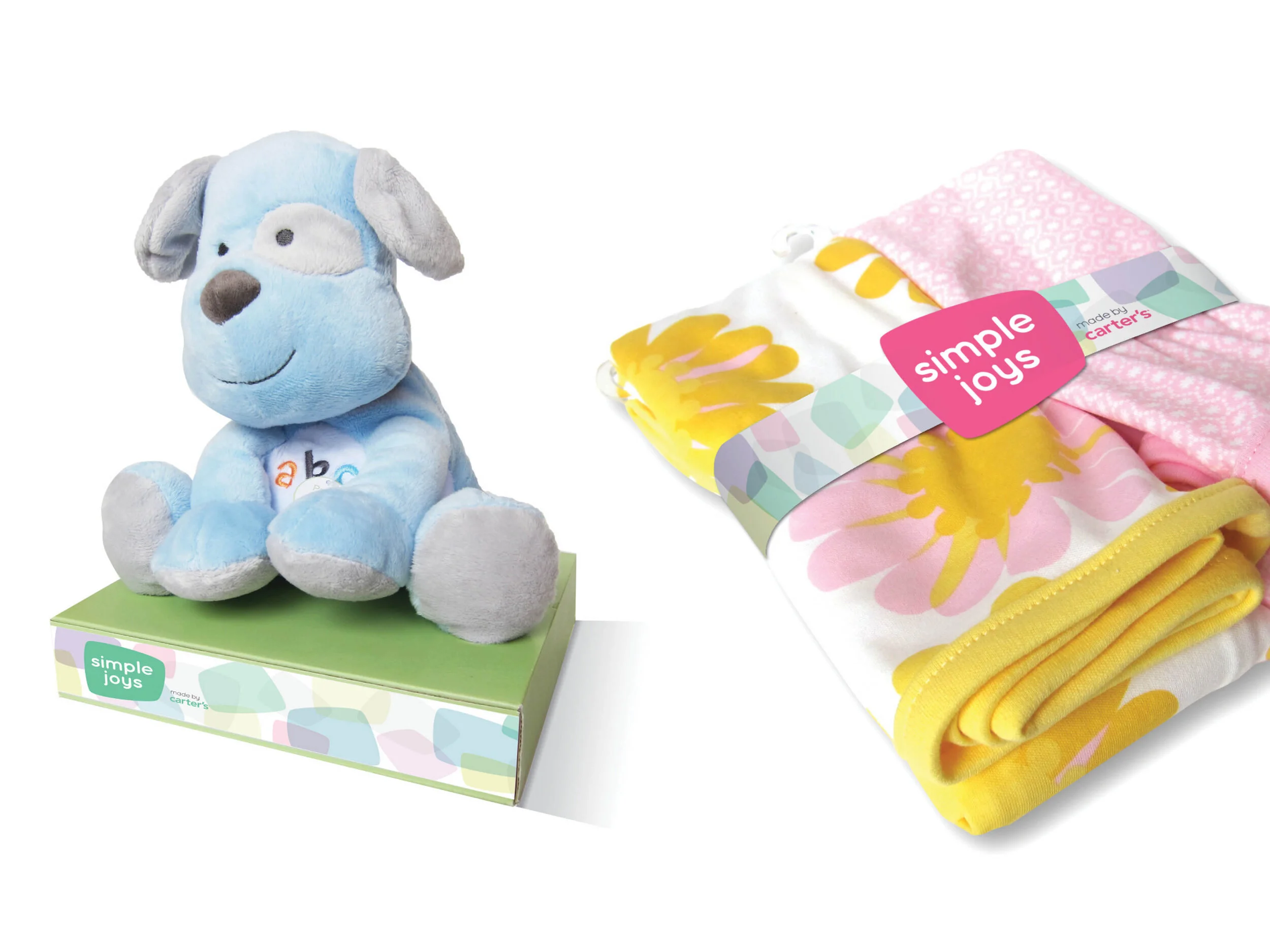


Carter’s came to Siegel+Gale looking to develop a sub-brand for Asian markets. After the naming team worked to develop “Simple Joys”, the design team went to work and developed three distinct identity directions.
I developed a direction that focused on the shape of things. Every child is unique and special and the joy that they discover in the small things inspired the thinking and visuals. Although the shape is bold, the colors and soft corners help give it a younger personality.
Siegel+Gale_ 2012 (proposed identity)